Scroll Down
Scroll Down
Scroll Down
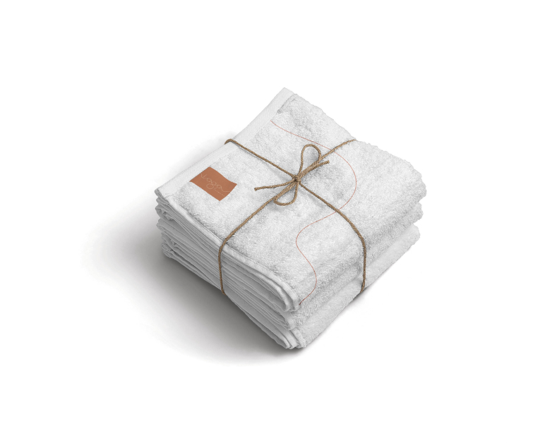
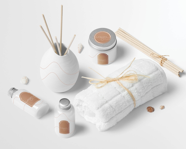
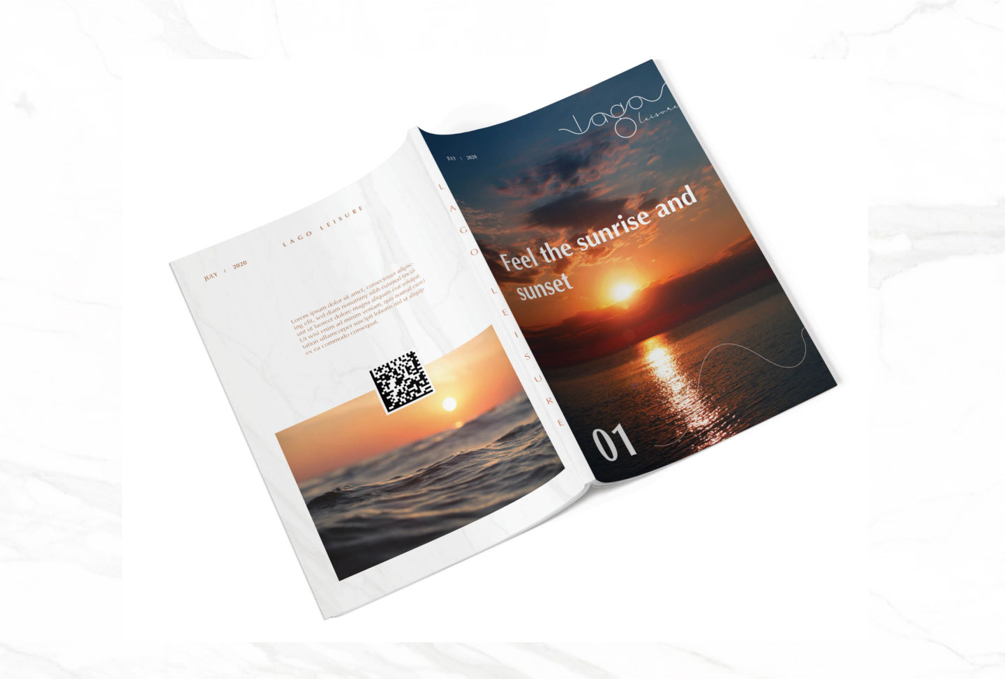
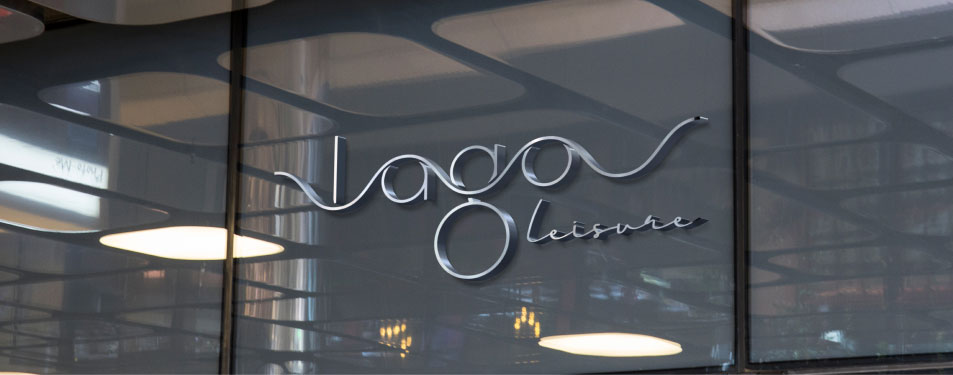
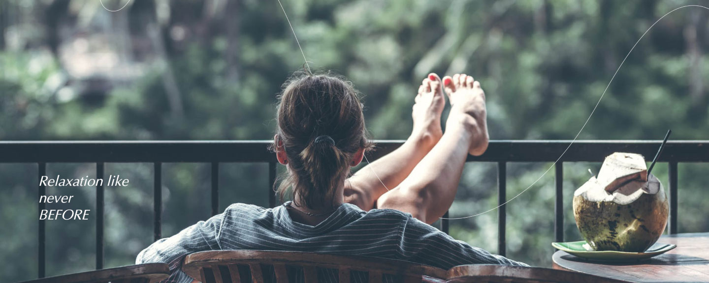
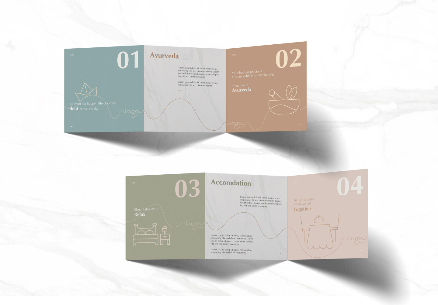
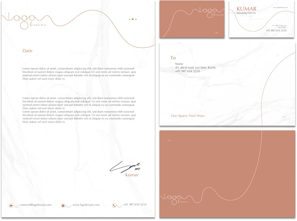
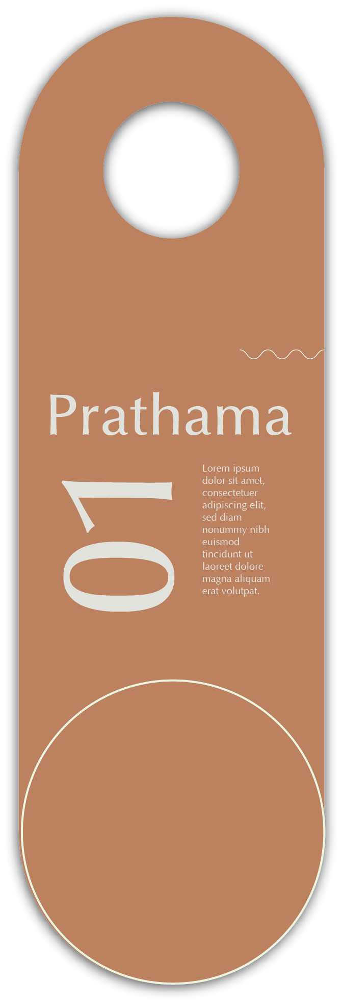
Our desire to get away to that place which gives us a sense of serenity seems to be inherent in each of us in various forms. Lago Leisure is a resort in Cherai, Cochin cradled between the turbulent waves of the Arabian Sea on one side and the serene backwaters on the other, with an unparalleled view that is sure to evoke these senses through their space and services. Stemming from a branding exercise and brand positioning strategy, our services extended into the Brand Identity Design of Lago Leisure Resort & Spa and various other applications of the branding in the resort not limited to their Signages, In room collaterals, Sales and Marketing Collaterals, and other Physical and Digital assets.
Industry
Hospitality
Services
Brand Strategy, Identity, Applications

Character Archetype
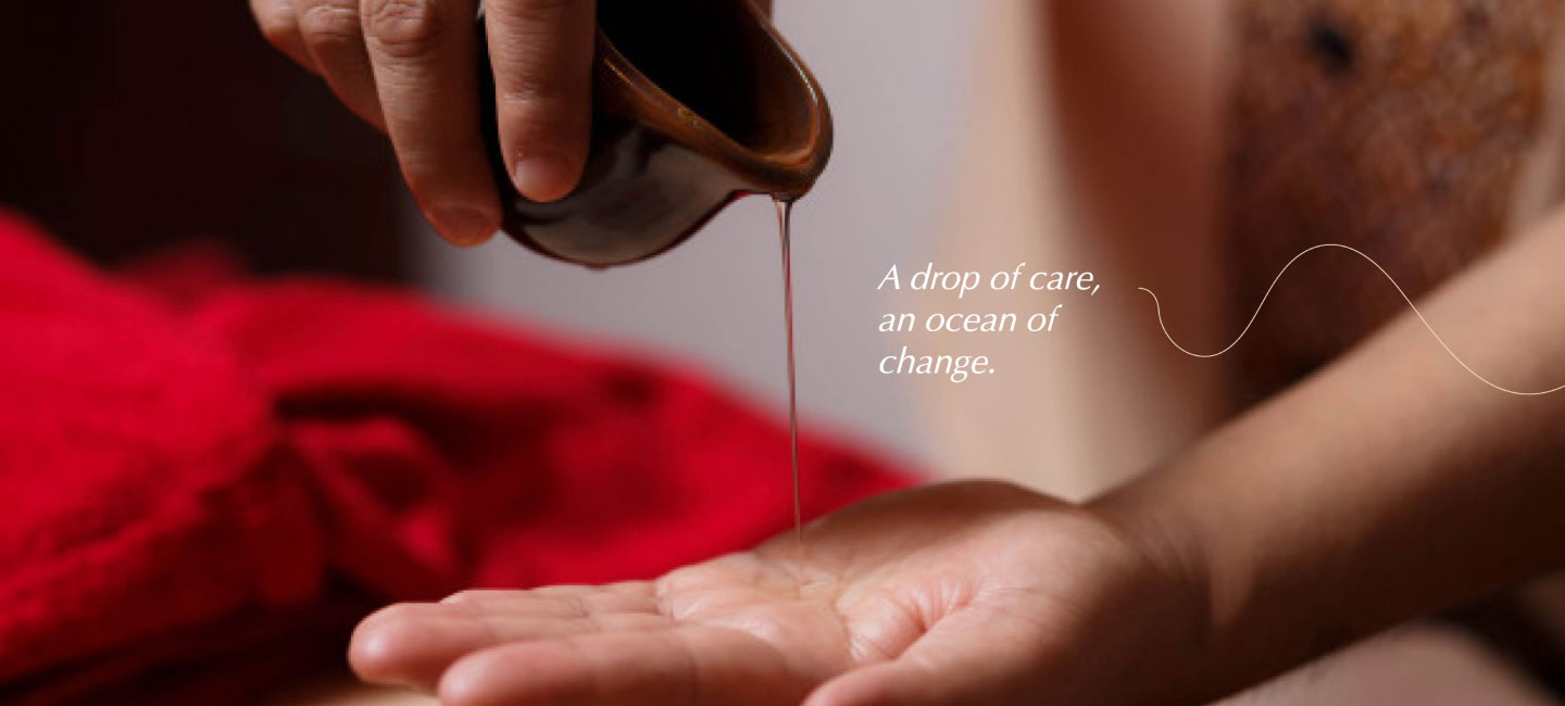
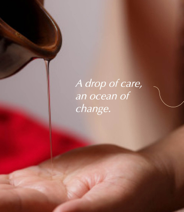
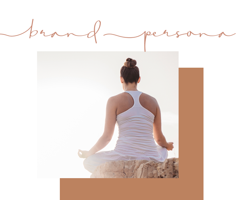
We identified the character archetypes of Lago Leisure as “The Lover '' and “ The Caregiver '' whose core desire during their existence is to be intimate and to experience the events happening to its fullest and to protect and care for others. The guests coming to the space can spend the precious moments in their life in this aura. They are getting personal attention and good care along with an opportunity to experience serenity, thereby reflecting this peace in their life.
Tone of Voice
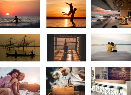
Brand Voice is the element that remains consistent across all the brand communications, which expresses the unique values and personality of the brand. Voice being the brand’s personality, tone is how we express that personality which can change depending on the context. Messaging tone and Brandvoice keywords of Lago Leisure are Caring, Calm, Humble, Romantic, Soulful, Rejuvenating, Elegant, Serene, and Warm

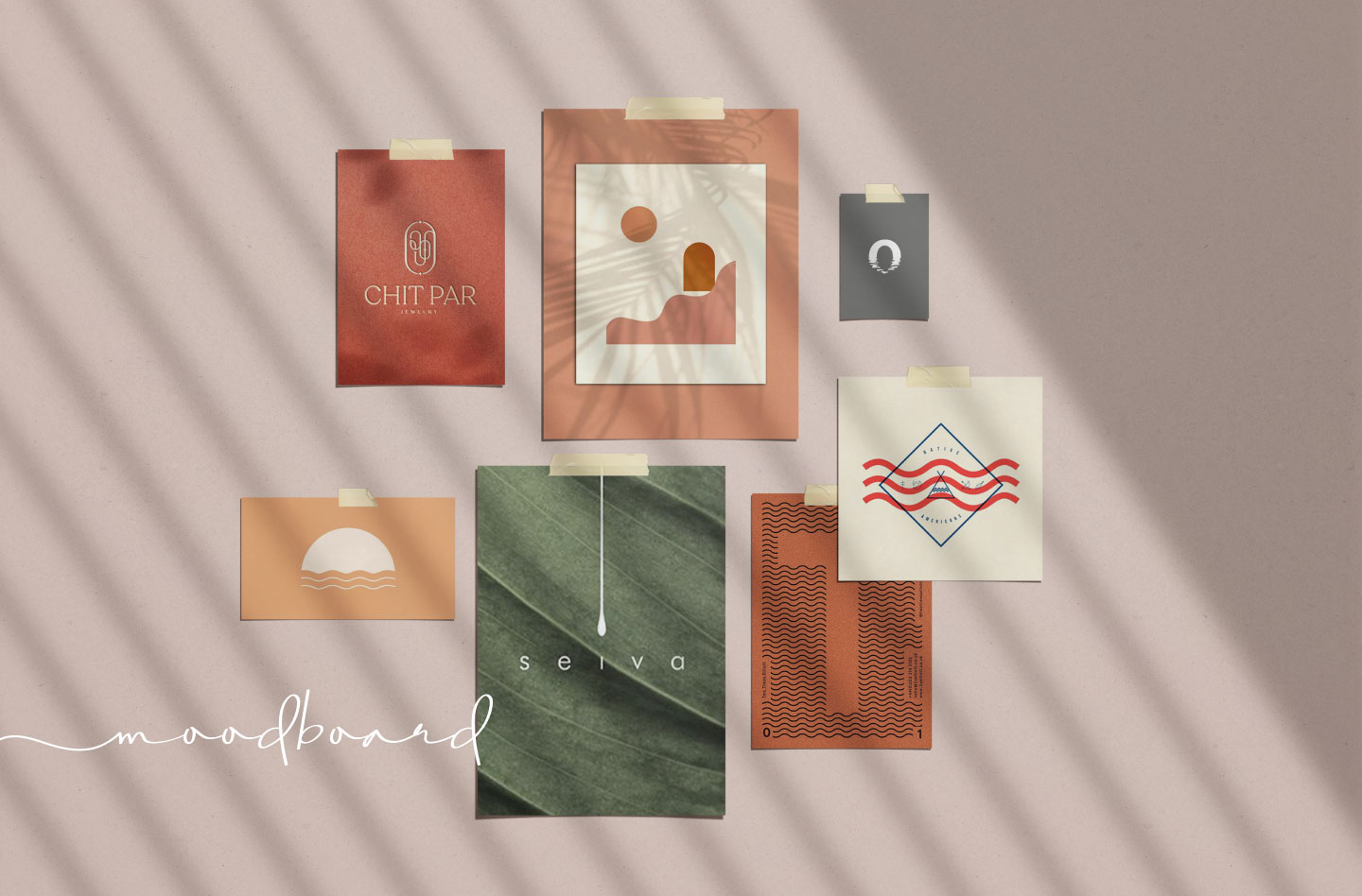
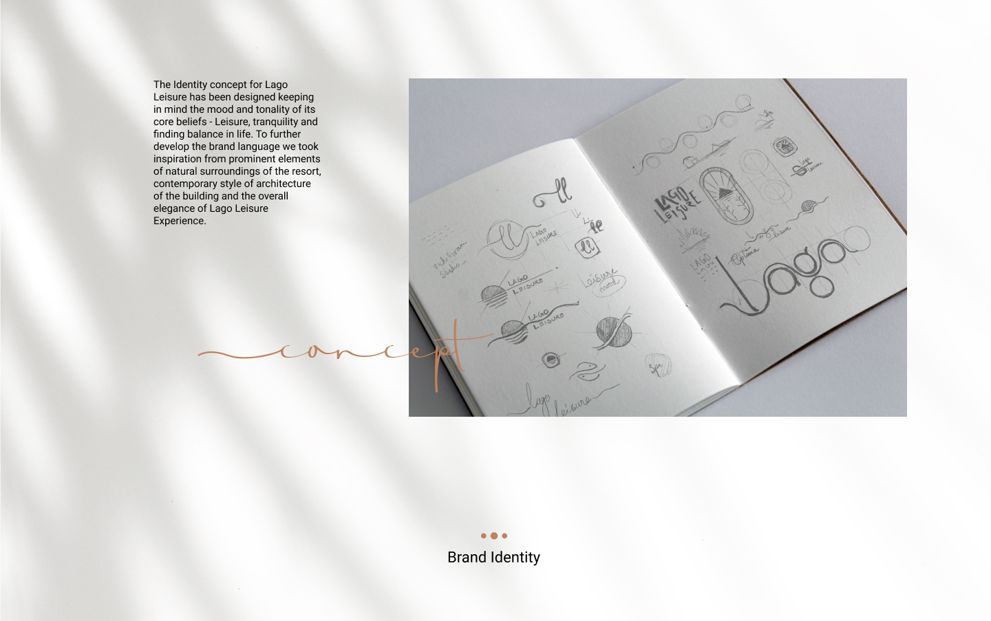
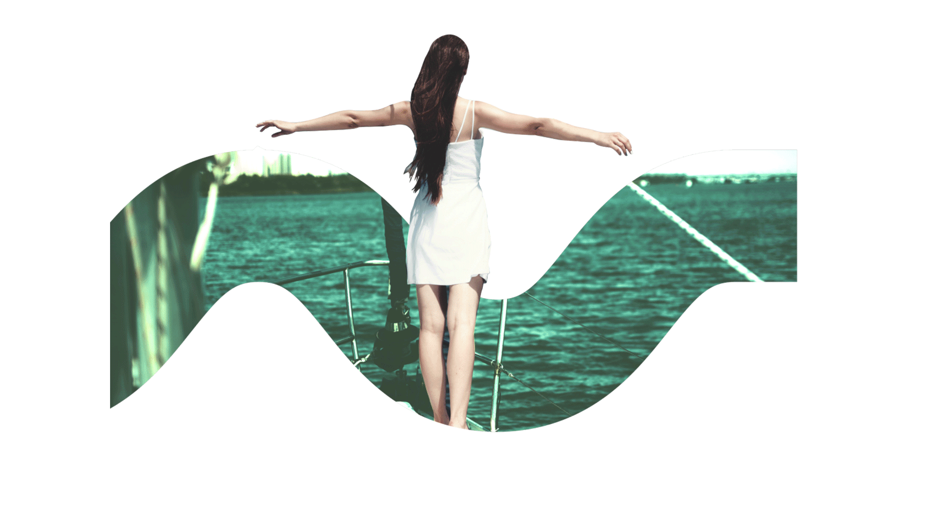
The Identity concept for Lago Leisure has been designed keeping in mind the mood and tonality of its core beliefs - Leisure, tranquility and finding balance in life. To further develop the brand language we took inspiration from prominent elements of natural surroundings of the resort, contemporary style of architecture of the building and the overall elegance of Lago Leisure Experience.


Brand Identity
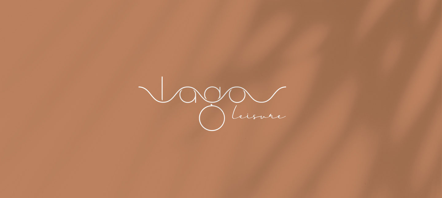
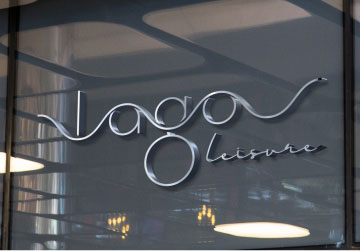
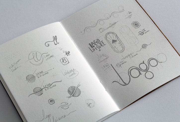
The elements in the logo attempt to create a sense of what the customer can expect while staying at the resort, even before getting to the resort. The logotype is inspired from the keyword “ Leisure” which is the essence of the brand. The curvy handwritten style type is portraying the state of relaxation, customers getting out of their stay at the resort. It also resembles the elegant luxury ambience of the space. The logo is contemporary and gets away from traditional spaces but at the same time maintains its honesty and reflects the modern approach and essence of the brand.
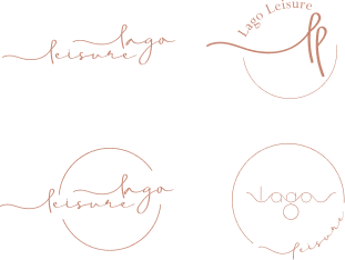
Brand Identity Variations

Brand Color
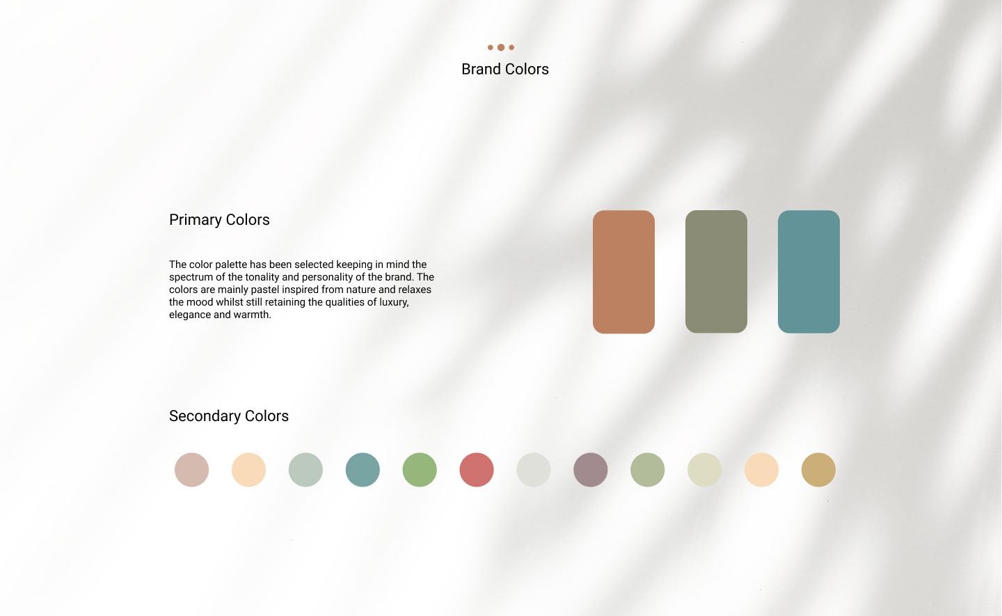
Primary Colors
The color palette has been selected keeping in mind the spectrum of the tonality and personality of the brand. The colors are mainly pastel inspired from nature and relaxes the mood whilst still retaining the qualities of luxury, elegance and warmth.

Primary Colors

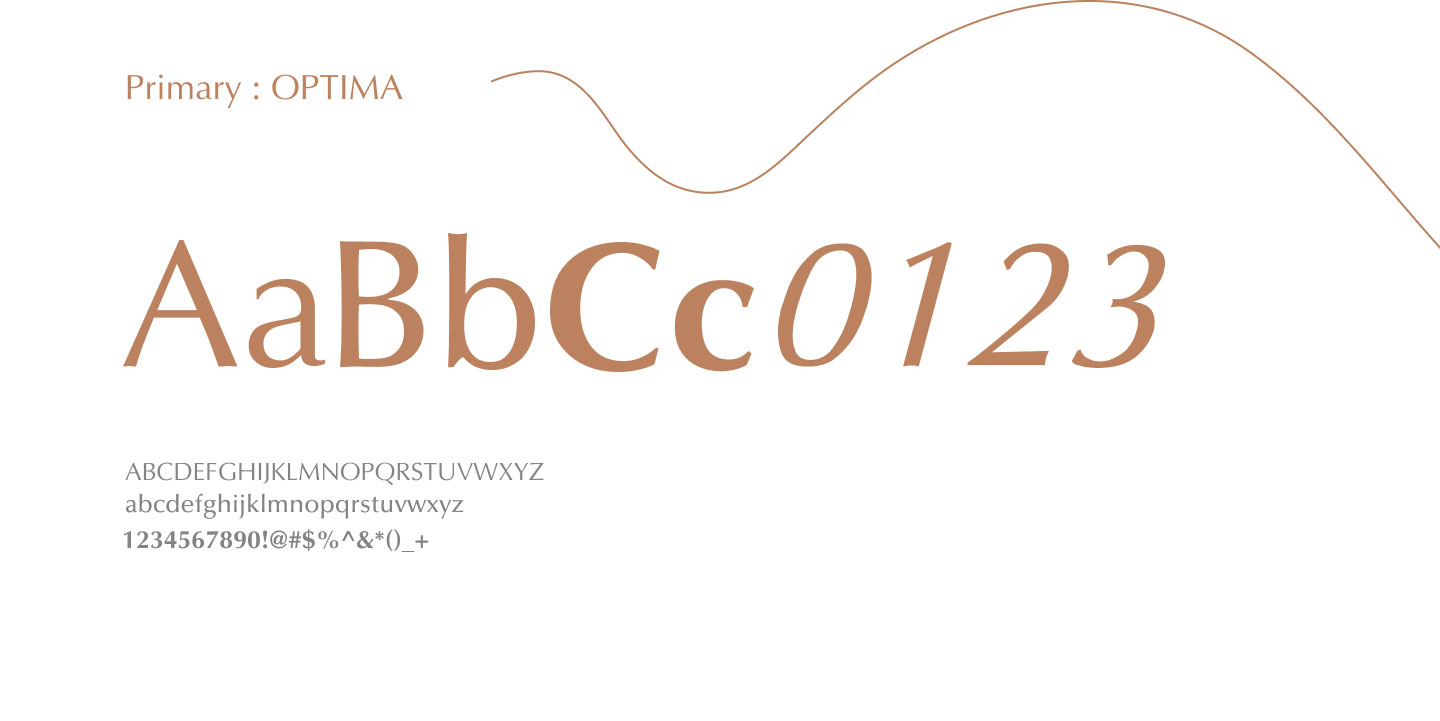
Brand Typeface


Water is a prominent element in the natural ecosystem of Lago Leisure Resort & Spa. The reflections in the moonlit lake and ripples happening on the surface were inspired for developing the mood of the brand. Each room is named after Shukla Paksha (Waxing Moon period) a period of 15 days, which begins on the Shukla Amavasya (New Moon) day and culminating Purnima (Full Moon) day and is considered auspicious because it is favorable to growth or expansion on every plane of existence i.e. Mental, Physical and Spiritual Plane.