Scroll Down
Scroll Down
Scroll Down
Scope Of The Project
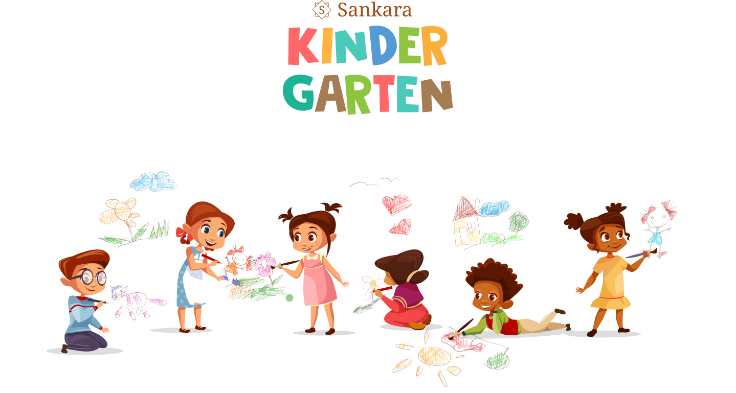
Sri Sankara Vidya Kendra was one of the first schools in North Chennai with a strong foundation in the teaching of Sankara. With its roots in cultural values, the school embraced modern pedagogy with the implementation of XSEED, Karadi Path, Smart Class etc. The project brief was for Brand Positioning to communicate the values of the organisation while modernising the brand to compete with the other school without loosing the essence of the institution. The rebranding was set to communicate the school’s ideologies and facilities and to attract educated parents who value and believes in the child-centric learning philosophy adopted at the school
With the strong ideologies of the brand, our approach was to retain the colours and interpret the brand values marrying meaningful forms.The overlapping squares emphasise duality (spiritual and material) and together they mean balance and non-duality. Drawing from the ontology of Advaita Vedanta, the hamsa (Swan) is a supreme symbol representing the wisdom of knowledge, wisdom and devotion. The book of knowledge signifies education, knowledge and wisdom. The finishing touch was the logotype with the perfect balance of modern and classic elegance.
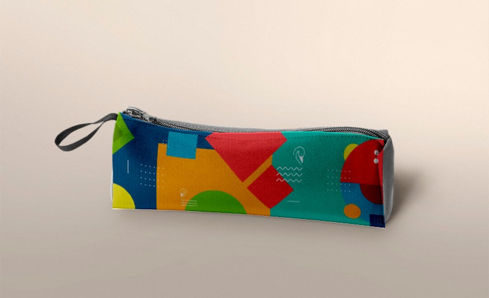
The next part of this exercise was designing all the brand touch points with the new branding (B.cards, ID cards, note books, Website, handbook).
Industry
School, Education
Services
Branding, Brand Applications
Challenges
Solution

Overlapping Squares
Squares are often connected with the physical world: four elementuality.

Ontology of Advaita Vedanta
The hamsa is an exquisite symbol for the Vedanta since it elegantly represents the core va

Book Of Knowledge
An open book signifies education, knowledge and wisdom.
Logo Construction
Logo
Identity Variation
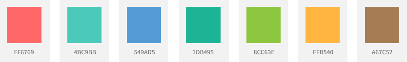
Color palette
Primary
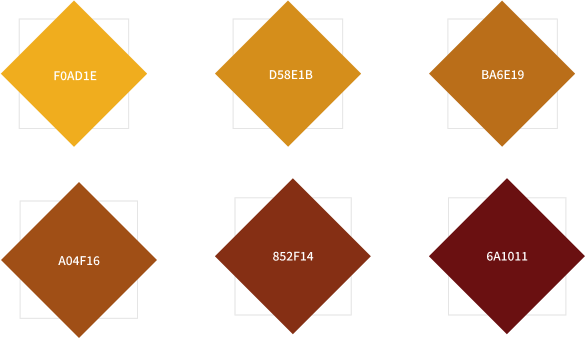
Secondary