Scroll Down
Scroll Down
Scroll Down
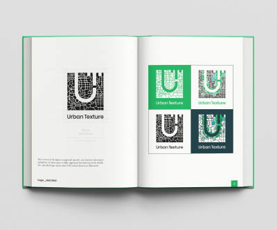
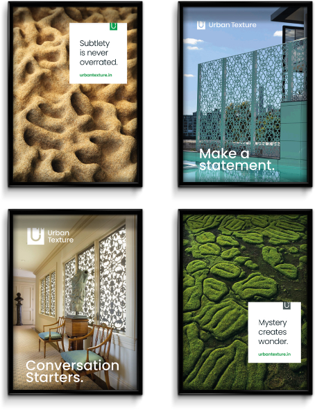
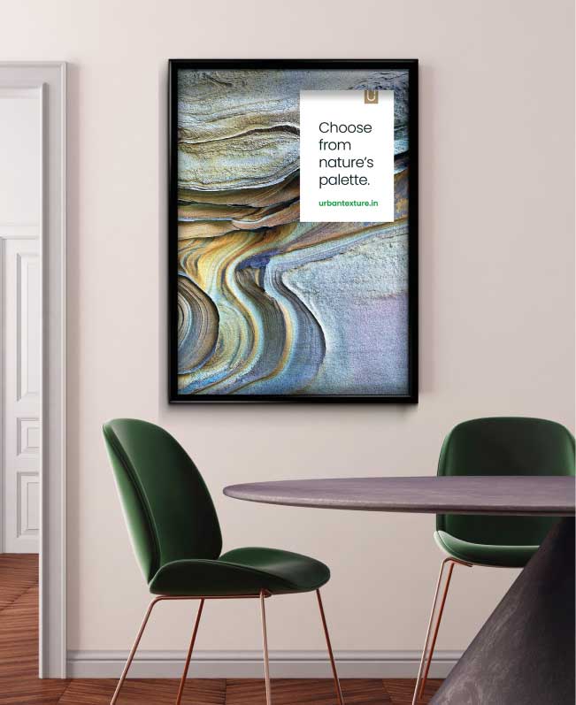
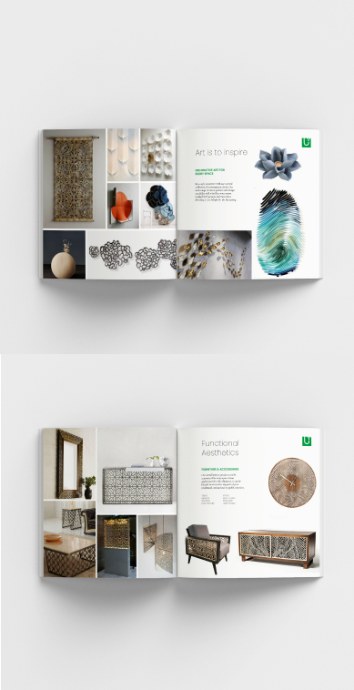
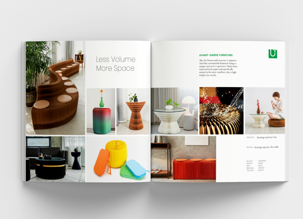
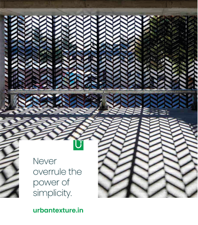
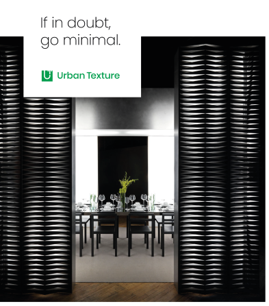
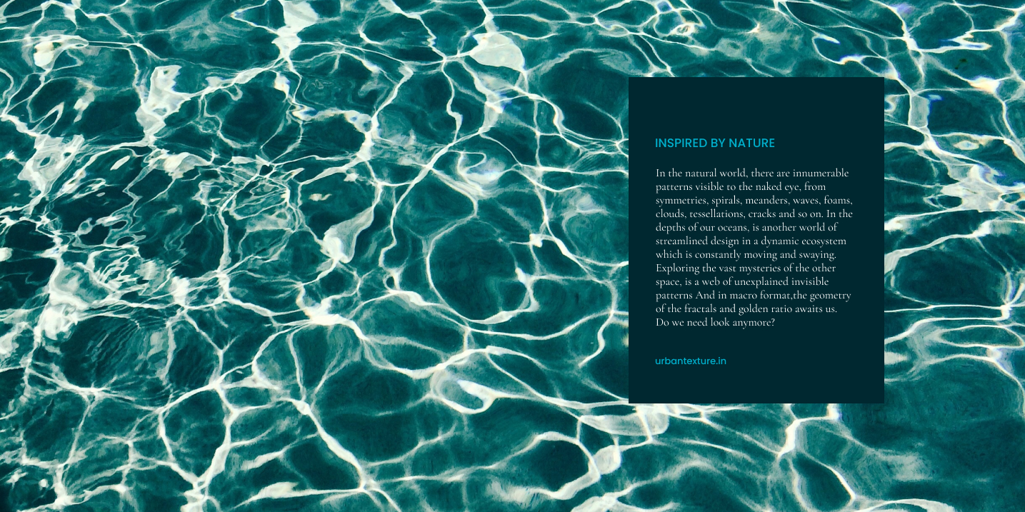
Established in 2016, Urban Texture offered custom laser-cut metal precuts for interiors and exteriors. In 2019, they opened their first flagship experience store and added wall decor, installation and bespoke products. A new identity would redefine the brand positioning in the art & decor space for this young brand.
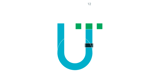
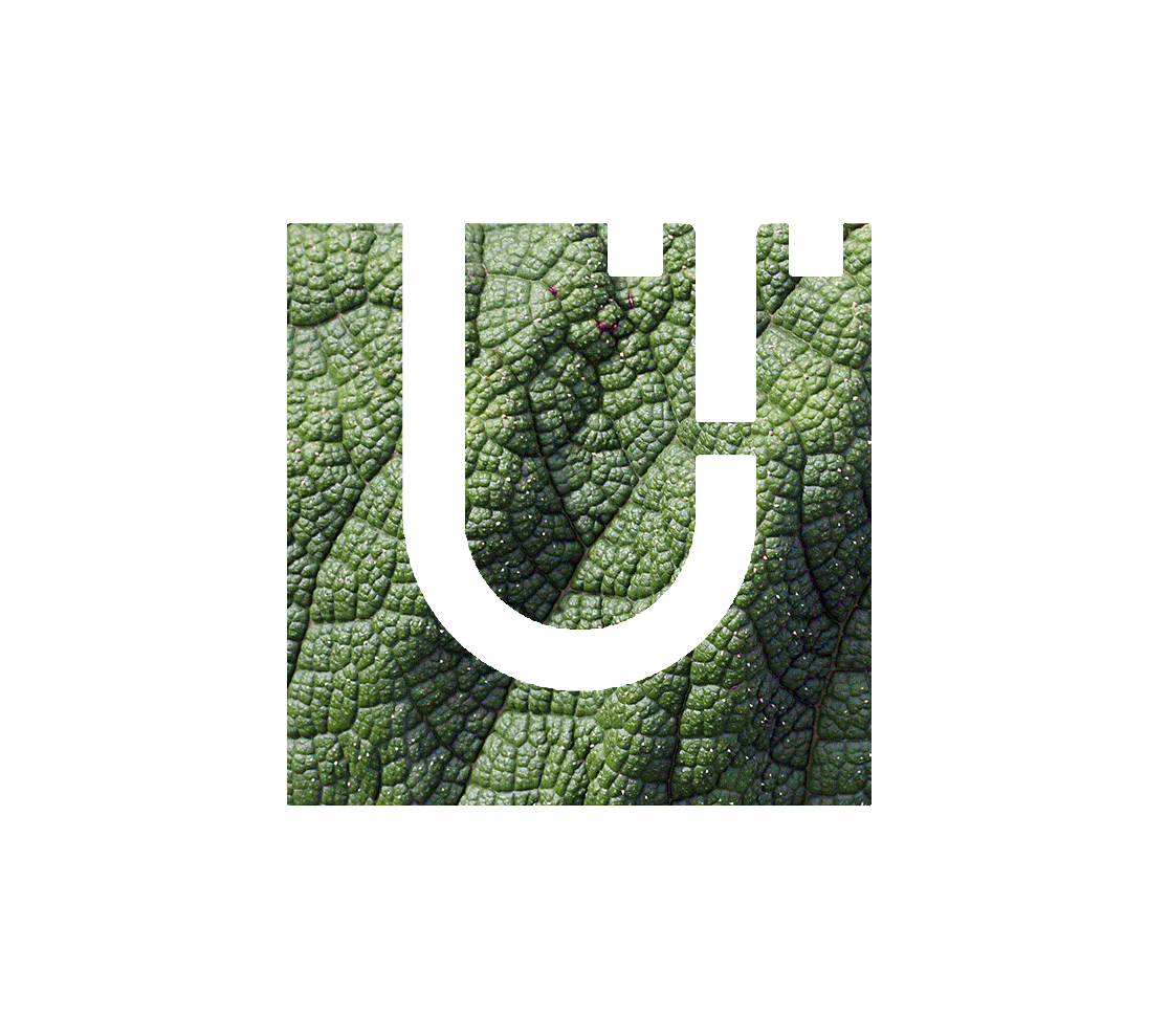
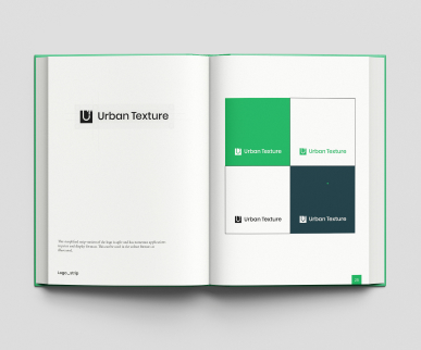
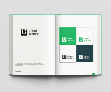
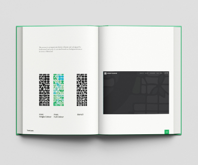
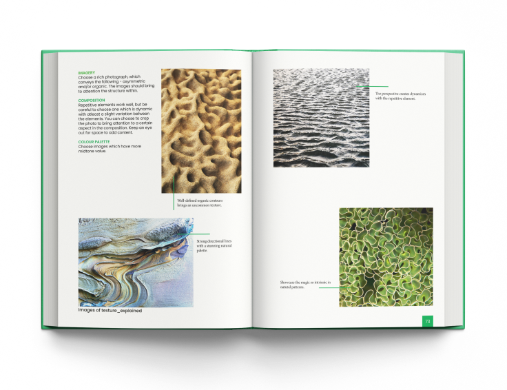
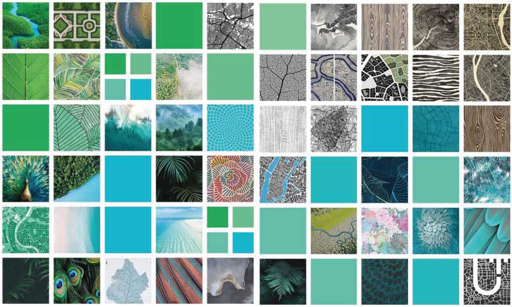
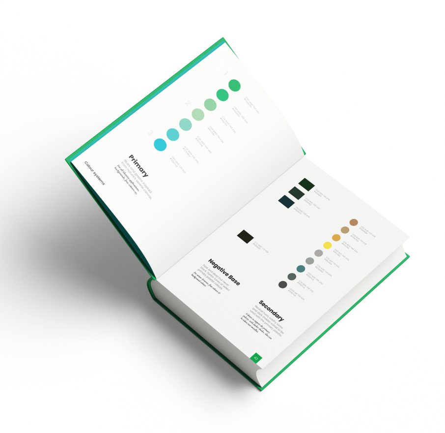
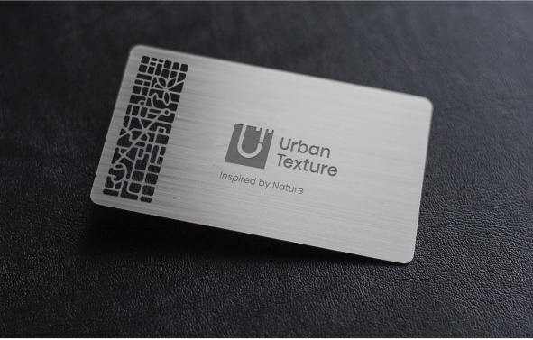
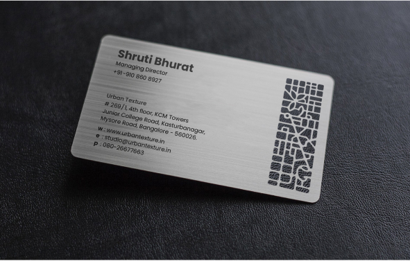
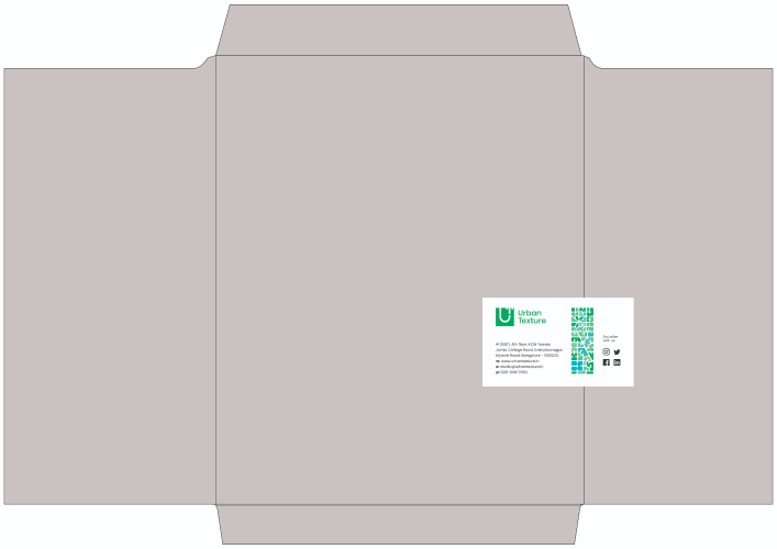
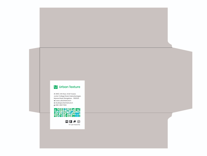
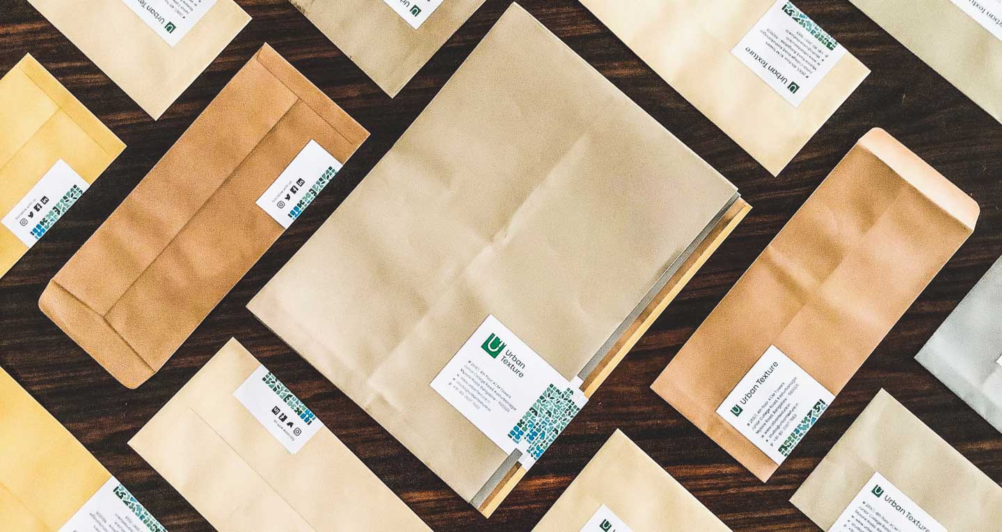
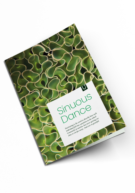
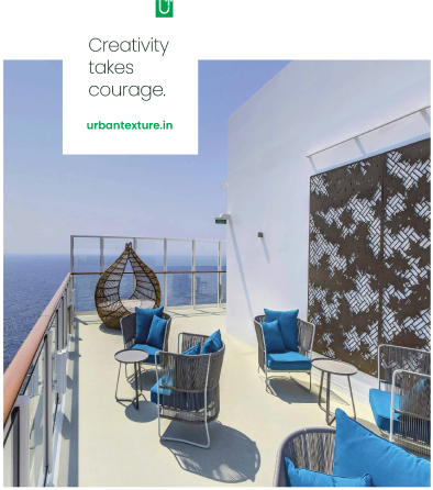
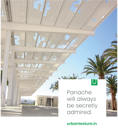
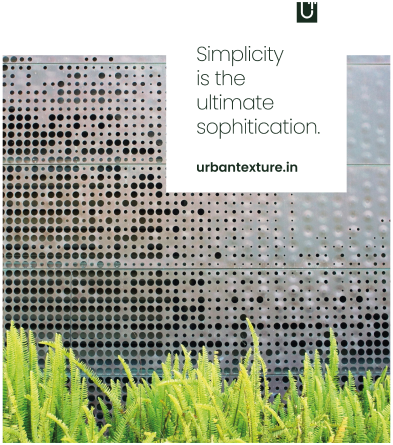
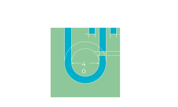
We created a dynamic identity for the brand, constructed from pure geometry with circles and lines, combining the letter forms of ‘U’ and ’T’, as the brand was popularly referred to as UT. An intricate version of the logo was also developed which could be laser cut, which will act as a product showcase and be a signage as well. The colour palette of Urban Texture is modern, fresh and nature derived, while the textures are inspired by the intricate and mystical patterns of nature.
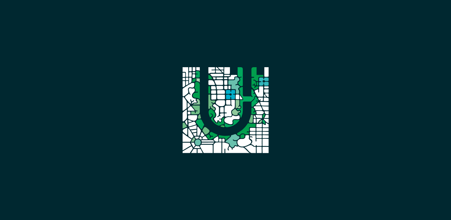
UT Icon
Primary
UT Icon
Secondary